In the second part of this two-part series, FIGT member Ema Naito shares how, with a few thoughtful choices, your slides and posters can reach a greater audience.
 By Ema Naito
If you missed Part 1 of this article, find it here.
Tips for writing: Slides & posters
Some of us will have slides and all presenters are invited to submit e-posters, so here are additional tips for writing.
1. Stick to one key message per slide, per sentence.
Use short sentences, no more than 15-20 words long (on average—for variety, you make some shorter and some longer).
It makes the sentences easier to read and understand.
(Source: “How to write plain English,” Plain English Campaign.)
2. Say WHO is doing WHAT
When writing in English, make sure you make it clear WHO is doing WHAT.
That often means you should try to use the active voice.
Passive: The challenges were acknowledged (by zombies?).
Active: We acknowledged the challenges.
If you can add “by zombies” at the end, that may mean it’s in the passive voice :)
In passive voice, WHO is doing the action can get easily hidden. Unless the focus is on WHAT was done, make sure you’re clear on the WHO.

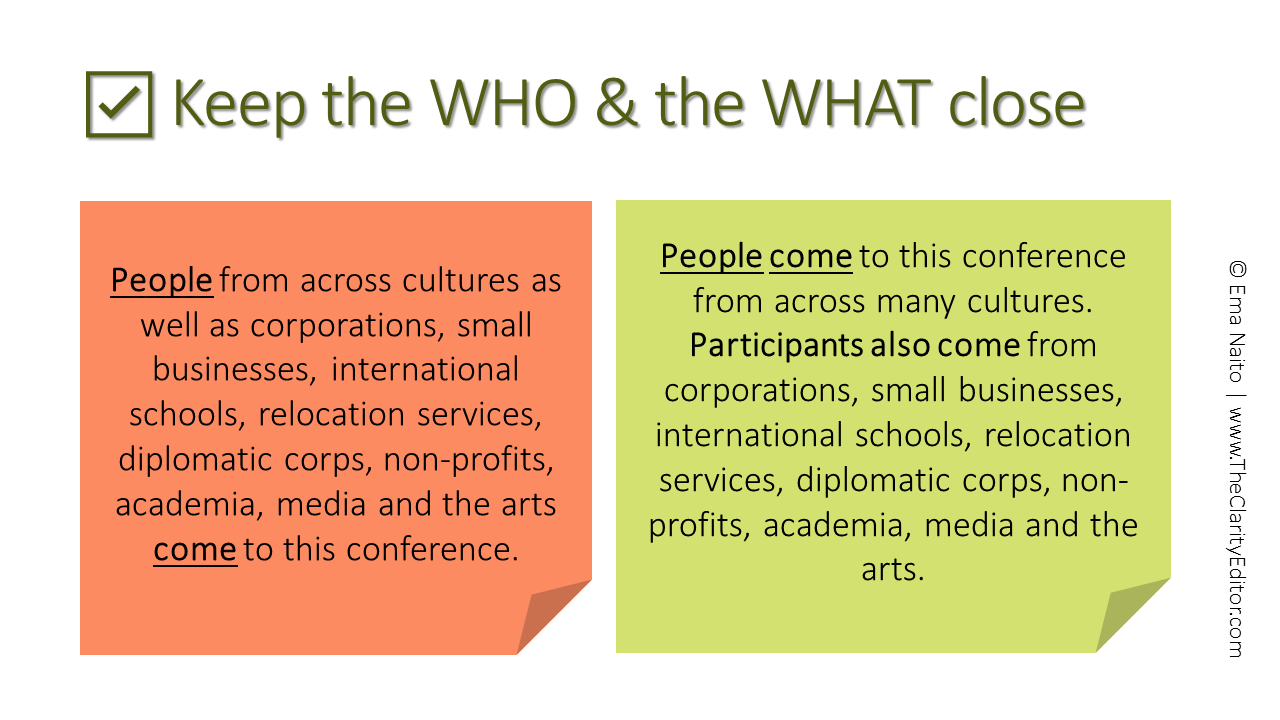
3. Keep the WHO & the WHAT close
Following from the point above, you also should try to keep that WHO and the WHAT close to each other in the sentence. It will help readers from getting lost.
BEFORE
People from across cultures as well as corporations, small businesses, international schools, relocation services, diplomatic corps, non-profits, academia, media and the arts come to this conference.
[By the time you get to the WHAT (“come”), you’ve forgotten about the WHO (“people”).]
AFTER
People come to this conference from across many cultures. Participants also come from corporations, small businesses, international schools, relocation services, diplomatic corps, non-profits, academia, media and the arts.
You may also need to cut the sentences into two.
4. Consider readability
Readability isn’t about making things look pretty. It’s about making your slides and e-posters accessible to your diverse audiences.
(And it will help make your slides and e-posters more inviting, so people will want to read them.)
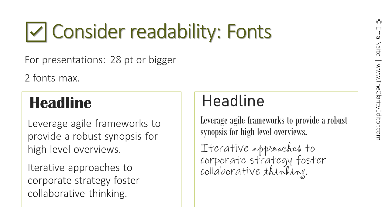
Fonts
Pick fonts that are readable and use a legible size.
-
For presentations: 28 pt or bigger (but some fonts are easier to read than others so choose wisely)
-
On screen: sans serif fonts are easier to read (because they have evenly thicker lines)
-
Use only two different fonts, max. (unless you know what you’re doing)
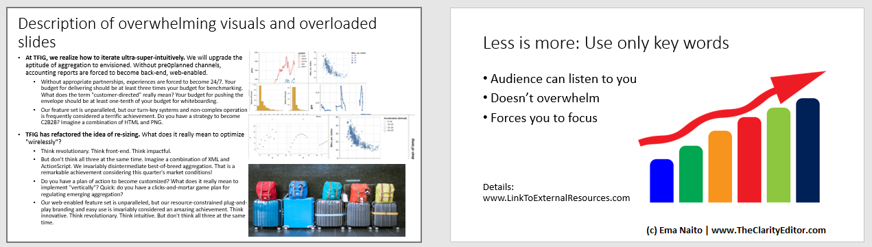
White space
“White space is thinking space.”
Don’t cram everything you can onto your slides or e-posters. It’s
- difficult (if not impossible) to read
- overwhelming
- uninviting—who would want to read it?
Less is more. Use only key words and simplified graphics.
That way, the audience can listen to you (the screen doesn’t compete for their attention).
It doesn’t overwhelm your audience (imagine if you had anxiety or were stressed). It makes it easier for anyone using a screen reader to follow.
And it forces you to focus on your most important messages.
(You can always add links where people can learn more if they want.)
Contrast
Be careful of the colors you use.
Consider the following:
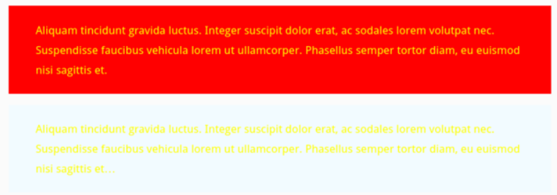
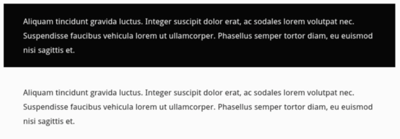
People can’t read this—the colors are too stark (and anxiety-inducing!) or the contrast is too weak.
How about this:
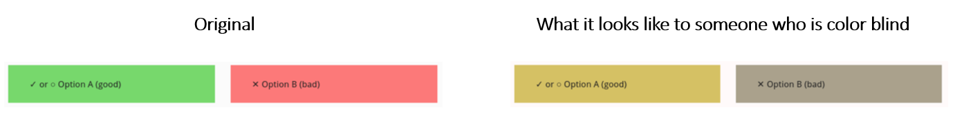
Also consider if someone is color-blind. It will look different.
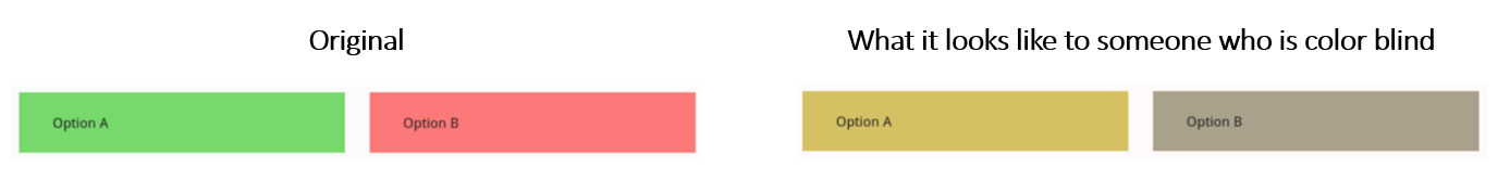
So if you use red to mean “bad” and green for “good,” make sure the information is conveyed in other ways too. Don’t rely only on color.
Summary
So! To sum up:
When speaking
Choose your words
- Avoid slang
- Avoid jargon & abbreviations – but if you must use them, explain the word first
- Use plain words
Focus on action
- Use active verbs (rescue the actions from the nouns)
Speak SLOWLY!
When writing: Posters, slides
Be selective
Design for readability
Resources
There are many great resources out there on all the points above.
Plain language
Accessibility
Design basics
Presentations
* Many thanks to Sarah Black, Athru Communications, for the accessibility & inclusion resources.


Ema Naito is an English editor who is passionate about clear, plain language. A bilingual third culture kid, Ema grew up between Tokyo and the US East Coast. She now lives in Bangkok, is an FIGT volunteer, and will be hosting a Kitchen Table Conversation at FIGT2022. You can find more of her tips on clear and accessible writing at www.TheClarityEditor.com.